
Task: Create a time variable (t = 0:.3:30) and evaluate the function f=exp(-.2*t).*sin(.5*t).^2. Plot the function in four windows (2x2) using subplot(). In each plot use the four different choices for axis (square, tight, equal, normal) to see the effect of each. Create the same 4 plots in a second window with the same four choices for axis but have grid on in each subplot.
There are a large number of axis properties for a plot. We will see how to control these choices when we get to handle graphics. However, there are some simple ways to control some properties such as the length of plot axes and the relative size of the two axes.
MATLAB chooses the range of user units on plot axes based on the range of values being plotted. Sometimes, these choices do not produce a useful or effective plot. We saw before that xlim([x1 x2]) and ylim([y1 y2]) control the range of user units on individual axes. This command can be combined into a single command of the form axis([x1 x2 y1 y2]) which sets the size of both axes.
One can also use the command axis tight after a graph has been drawn to limit the range of units on each axis to the minimum and maximum of the x and y arrays being plotted.
MATLAB also controls the shape of the graph (that is, the lengths of the two axes). You may have noticed that the x axis is longer than the y axis producing a rectangular plot. In some cases, you may want the length of the x and y axis to be the same. This can be done with axis square after a figure has been drawn.
Even if the range of values on the two axes are not the same, it is possible to have each axis have the same size for tickmarks with axis equal.
If you deside that you don't like the look of the plot after trying square or equal, then the command axis normal returns to the original axis lengths.
The command axis auto restores axis scaling to automatic mode.
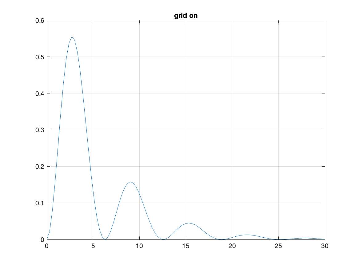
For some graphs, it can be effective to continue the tick marks across the plot to make a grid pattern. This can be done with grid on. It is possible to have different character of grid lines on the minor tick marks with grid minor. You might notice that plots become hard to read sometimes with a grid background. The grid can be removed with grid off.
By default, plot only draws two axes (bottom and left sides of the figure. Axes and tick marks can be put on the other two sides of the plot with box on. To remove the extra axes, use box off.
It is even possible to remove any axis markings on a figure. The command axis off makes axes and labels invisible. You might think of the circumstances under which you would want a plot to have no axes. One possibility would be to use one of the panels of a subplot to provide information about the other panels in the plot.
axis on restores the axes making them visible again.
Flow chart for task %%% evaluate t and f %%% set up subplots %%% plot (t,f) choose different axis styles %%% set up subplots %%% plot (t,f) choose different axis styles %%% turn on grids
Solution script for task:
%%%  evaluate t and f
t=0:.3:30;f=exp(-.2*t).*sin(.5*t).^2;
figure
%%%  set up subplots
  subplot(2,2,1)
%%%     plot (t,f) choose different axis styles
   plot(t,f)
   axis square
   title('axis square')
  subplot(2,2,2)
%%%     plot (t,f) choose different axis styles
   plot(t,f)
   axis tight
   title('axis tight')
  subplot(2,2,3)
%%%     plot (t,f) choose different axis styles
   plot(t,f)
   axis equal
   title('axis equal')
  subplot(2,2,4)
%%%     plot (t,f) choose different axis styles
   plot(t,f)
   axis normal
   title('axis normal')
figure
%%%  set up subplots
  subplot(2,2,1)
%%%     plot (t,f) choose different axis styles
   plot(t,f)
   axis square
%%%     turn on grids
   grid on
   title('axis square: grid on')
  subplot(2,2,2)
%%%     plot (t,f) choose different axis styles
   plot(t,f)
   axis tight
%%%     turn on grids
   grid on
   title('axis tight: grid on')
  subplot(2,2,3)
%%%     plot (t,f) choose different axis styles
   plot(t,f)
   axis equal
%%%     turn on grids
   grid on
   title('axis equal: grid on')
  subplot(2,2,4)
%%%     plot (t,f) choose different axis styles
   plot(t,f)
   axis normal
%%%     turn on grids
   grid on
   title('axis normal: grid on')