Task: Use the global elevation ( GlobalElev.mat) from the previous section. Extract the depth along the equator (average the lines 0.5 degree north and south of the equator-there is no line for latitude = 0). Use a pie chart to show the fraction of elevations/depths in 1000 m bins. Pull out the two sectors on either side of sea level.
Pie charts are similar to histograms, except they show fractional values of an array as wedges of a circle.
The simplest plot is created with pie(x), where x is a list of numbers. If sum(x) > 1, then the numbers are normalized as x/sum(x) to convert them to fractions. If sum(x) < 1, then it is assumed that the values are already fractions and not all fractions are represented. That is, the slices do not cover the entire circle.

Sometimes it is important to emphasize one or more sectors of the plot. The command pie(x,explode) will draw the pie chart. The array explode has the same size as x. Any sector for which explode > 0 will be pulled out the the circle a short distance.

You can provide labels for the pie plot with pie(x,LABELS), where LABELS is a cell array of character strings with the same number of rows as x. These character strings are used as labels for the various sectors of the pie plot.
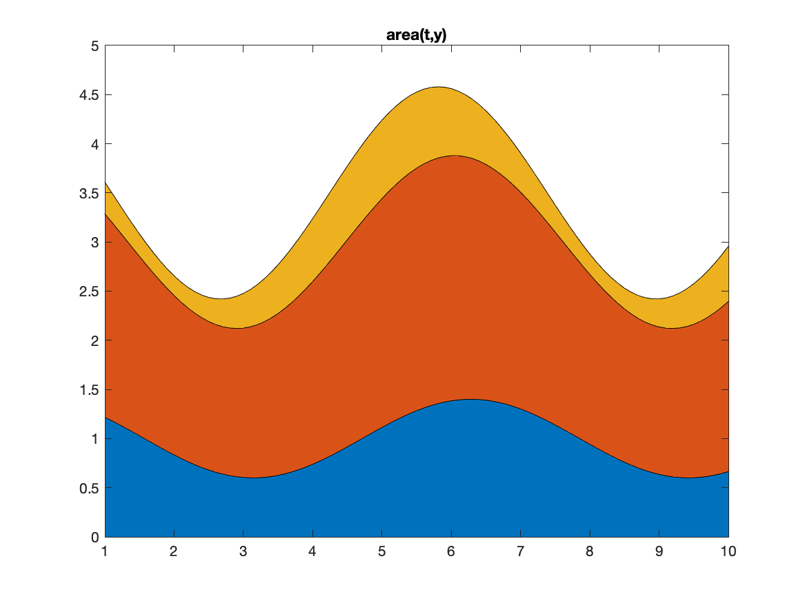
You might want to show fractional values as they change in time or space. If t is a set of times and y is a table of values (same number of columns as t), then area(t,y) will plot the rows of the successive y versus t but add the values along columns, producing a "stacked" plot for each time. The area between the lines will be filled with colors based on the current colormap.
As a simple example, let each row of Y have the values 1, 2 and 3. Then area(Y) will create a plot with a line at y=1 , y=3 and y=6. The area between y=0,1 will be one color. The area between y=1,3 will be another. The area between y=3,6 will be a third color.
A more complicated example has wiggly values for three arrays ( A, B, C). Then the first line shows the values of A. The area below this line is one color (blue in the example below). The next line is a plot of A+B. The area between the A and A+B lines is another color (orange in the example). The final lines shows the value of A+B+C with the area below this line being another color (yellow-orange in the example).

Flow chart for the task:
%%%  Extract depths on either side of the equator
%%%  calculate the average of depths
%%%  set up the edges of the bins
%%%  create labels for the sectors
%%%  calculate the number of values in each bin
%%%  set a vector to show the two sectors
%%%  create the pie plot
%%%  add a title
Solution script for the task:
%    row index 90, 91 are latitudes -0.5 and 0.5.
%%%  Extract depths on either side of the equator
  En=GlobalElev(90,:);Es=GlobalElev(91,:);
%%%  average the depths
  ElevEq=.5*(En+Es);  %  average elevation along the equator
%%%  set up the edges of the bins
  Edges=[-6000:1000:3000];
%%%  create labels for the sectors
  Labels={'-6:-5';'-5:-4';'-4:-3';'-3:-2';'-2;-1';'-1:0';'0:1';'1:2';'2:3'};
%%%  calculate the number of values in each bin
  [Count,BE]=histcounts(ElevEq,Edges);
%%%  set a vector to show the two sectors
  Ex=zeros(size(Count));Ex(6)=1;Ex(7)=1;
  figure
%%%  create the pie plot
    pie(Count,Ex,Labels);
%%%  add a title
    title('fraction of depth along equator')