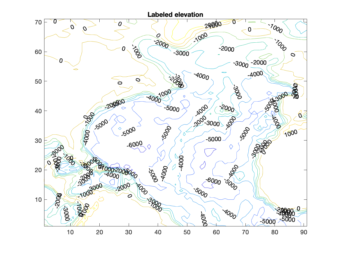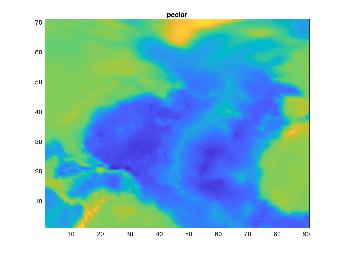
Task: Use the North Atlantic data from task 9.1. Contour the elevation in intervals of 1000 m and label the contour lines. Create a second figure making a scaled color contour of the elevations with pcolor.
The previous exercise was useful in displaying the character of the elevation array, but most times we want to choose the values for which contour lines are drawn. Furthermore, it would be nice to know what elevation is represented by the various lines.
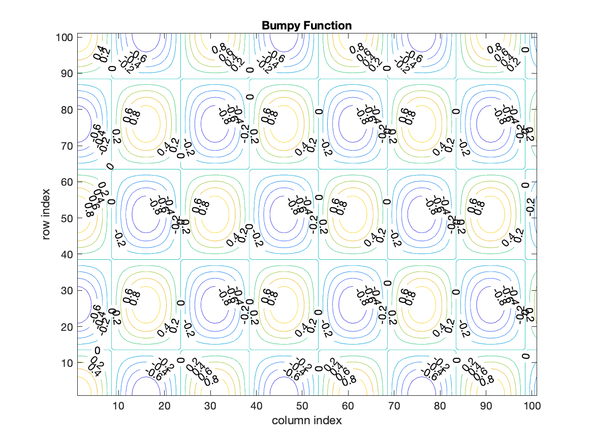
We need to save information from the contour command to put labels on the figure. With that information, we can label the various contour lines. The second line below allows the contour command to return two arrays: con, containing the contour values, and han, containing handles to the lines (we will learn about graphics handles in a later class). You can choose any name that you want for these arrays.
figure
[con han]=contour(F);
clabel(con,han)
title('Bumpy Function')
xlabel('column index')
ylabel('row index')
The third line above passes the contour information to a labeling routine:
clabel.
A second argument is used in the contour command to control the values at which contour lines are drawn.
figure
ci=[-.75:.25:.75];
[con han]=contour(F,ci);
clabel(con,han)
title('Bumpy Function')
xlabel('column index')
ylabel('row index')
The variable ci is a list of values to contour (contour interval), in this case from -.75 to .75 in steps of .25.
The array need not have uniform spacing, but it does need to be ordered from smallest to largest value.
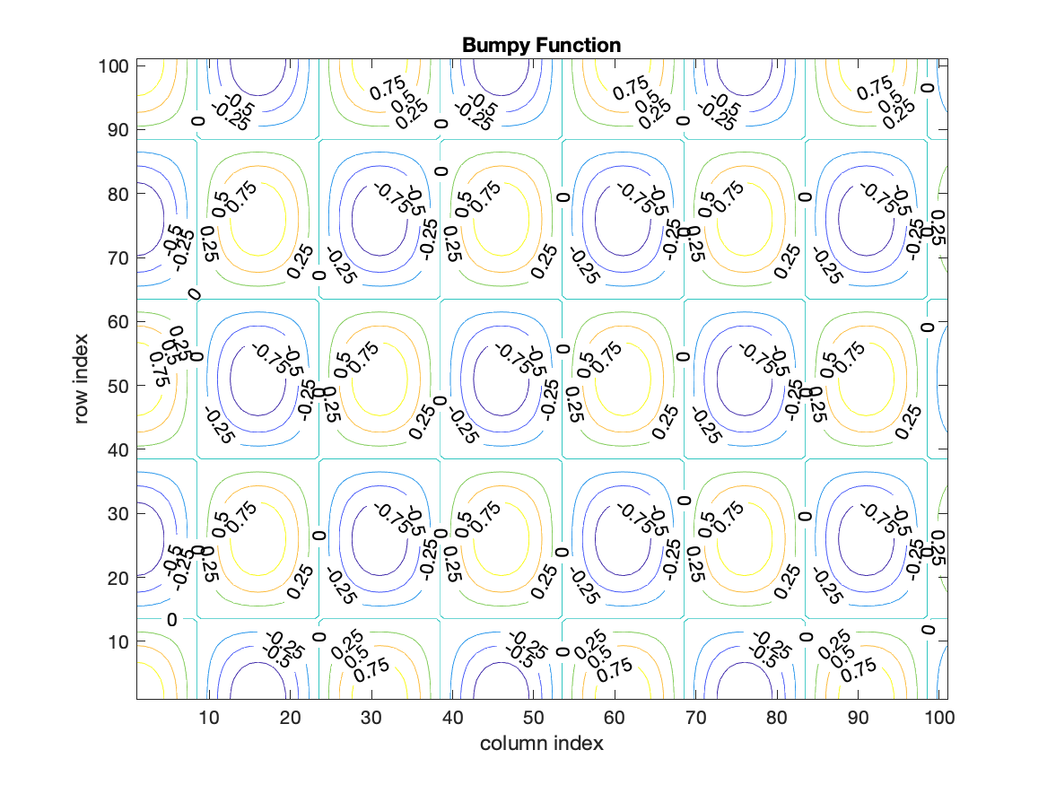
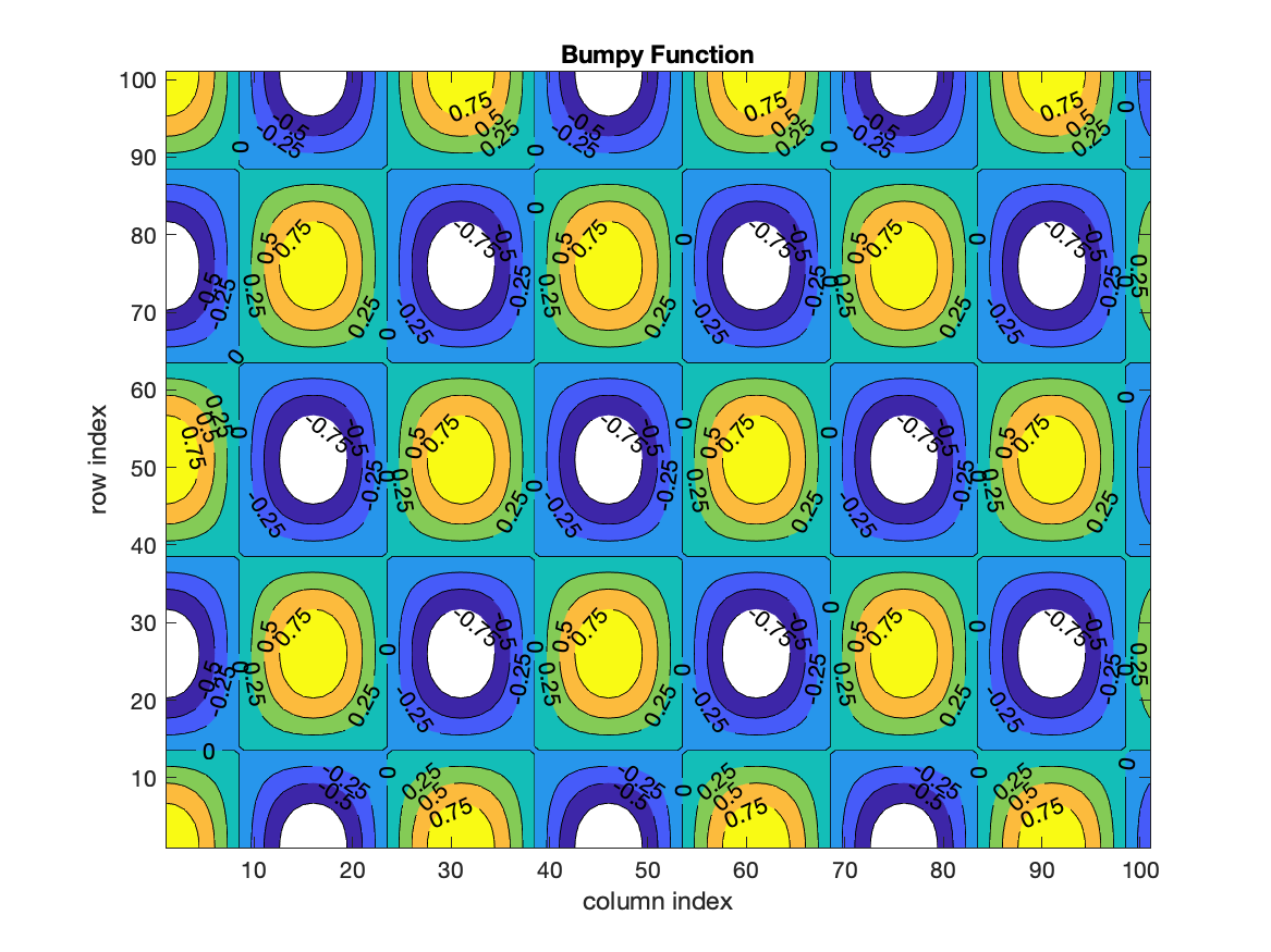
The space between contour lines can be filled with a color by using the command contourf. All of the options with contour also apply to contourf.
  ci=[-.75:.25:.75];
  [con han]=contourf(F,ci);
  clabel(con,han)
  title('Bumpy Function')
  xlabel('column index')
  ylabel('row index')
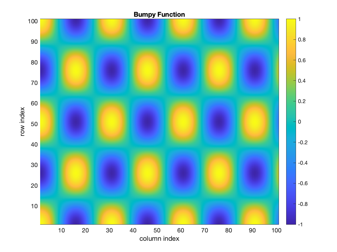
In addition to labeling contours, it is possible to add a colorbar showing the values associated with different colors; the command is colorbar. By default it appears to the right of the figure.
The final contouring tool is pcolor which places a grid of boxes over the figure and colors each cell with the color associated with the values at the SouthWest corners of the cell.
The command shading('interp') will remove the grid of lines and smoothly vary the colors across the cell. The default is recovered with shading('faceted'). For other options, see help shading.
figure
pcolor(F);
shading interp;colorbar;
title('Bumpy Function')
xlabel('column index')
ylabel('row index')
It is possible to control the colors being used in the various routines above. The topic of colors raises a number of details, which we will consider in more detail later. By default, MATLAB has 64 colors defined by 3 numbers specifying Red, Green, and Blue (RGB) light. The colors range from 0 (off) to 1 (full bright).
There are several pre-defined color maps named jet, hsf, hot, cool and so forth. A particular set of colors can be chosen with colormap('cool'). Look at the documentation for colormap for more choices.
The flow chart for the task solution:
%%%  load data
%%%  choose contour intervals
%%%  contour data
%%%  label contour lines
%%%  add title and labels
%%%  contour values with pcolor
%%%  add title and labels
Script to solve the task:
%%%  load data
load('NAbathy.mat'); %  get variables NAelev, NAlat, NAlon
%%%  choose contour intervals
ci=[-7000:1000:2000];
%%%  contour data
figure
  [C H]=contour(NAelev,ci);
%%%  label contour lines
  clabel(C,H);
%%%  add title and labels
  title('North Atlantic Elevation (m)')
  xlabel('column index')
  ylabel('row index')
%%%  contour values with pcolor
figure
  pcolor(NAelev,ci)
%%%  add title and labels
  title('North Atlantic Elevation (m)')
  xlabel('column index')
  ylabel('row index')